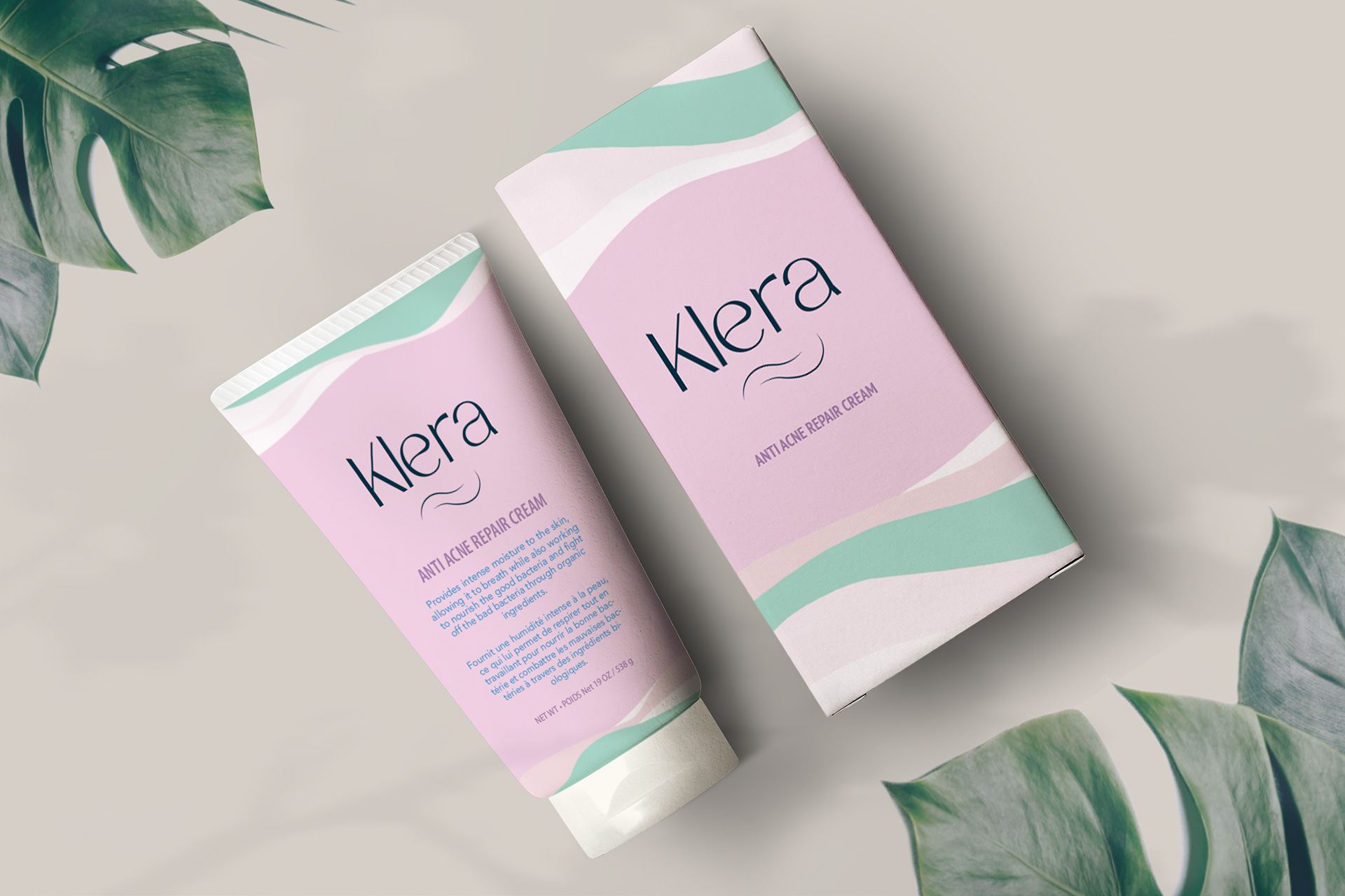

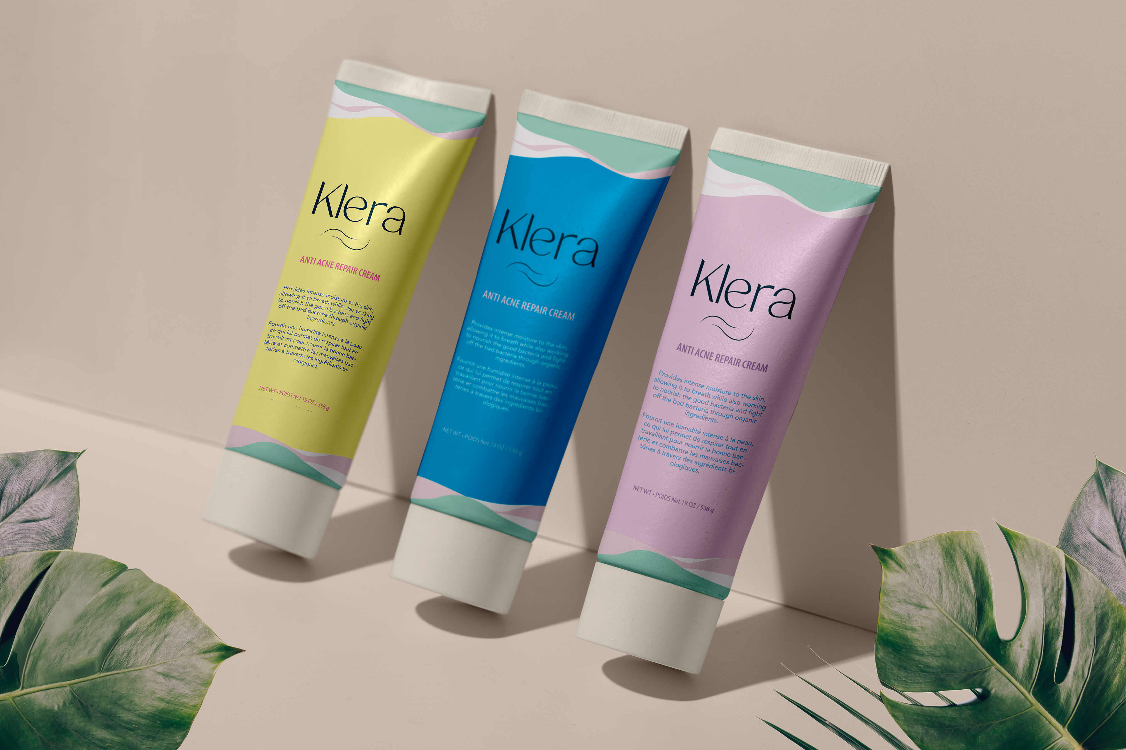
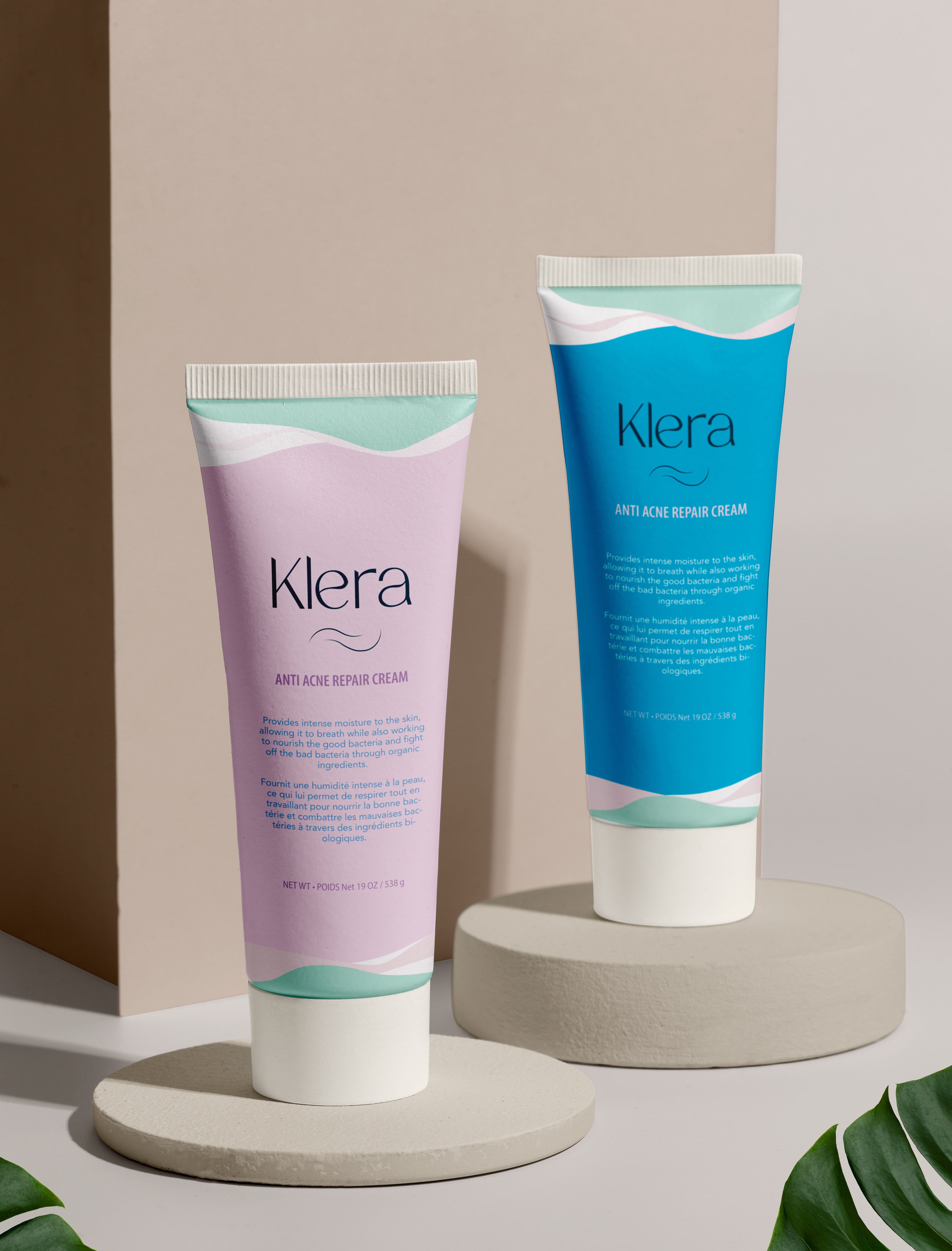
Klera is a cream brand that specializes in bringing beauty and health among women. Specializing in different beauty concerns such as acne, Klera strives to help women feel beautiful while also bringing healthy ingredients to make the skin feel its best self.
MY ROLE
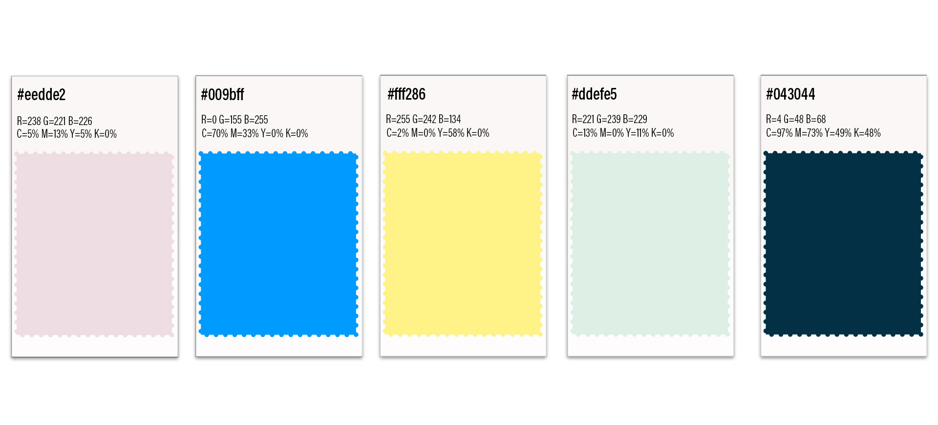
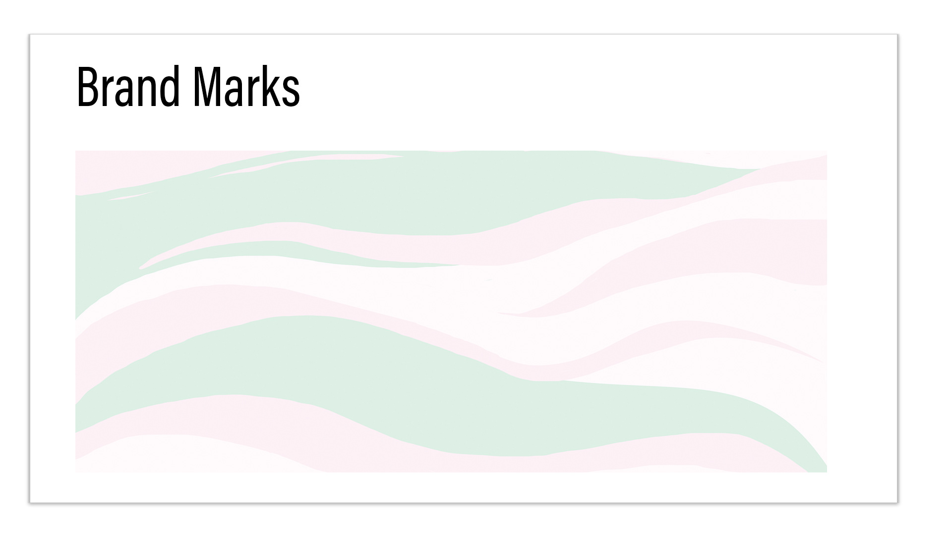
I created the branding design which included the logo, color theme, and branding marks, as well as the packaging design.
THOUGHT PROCESS
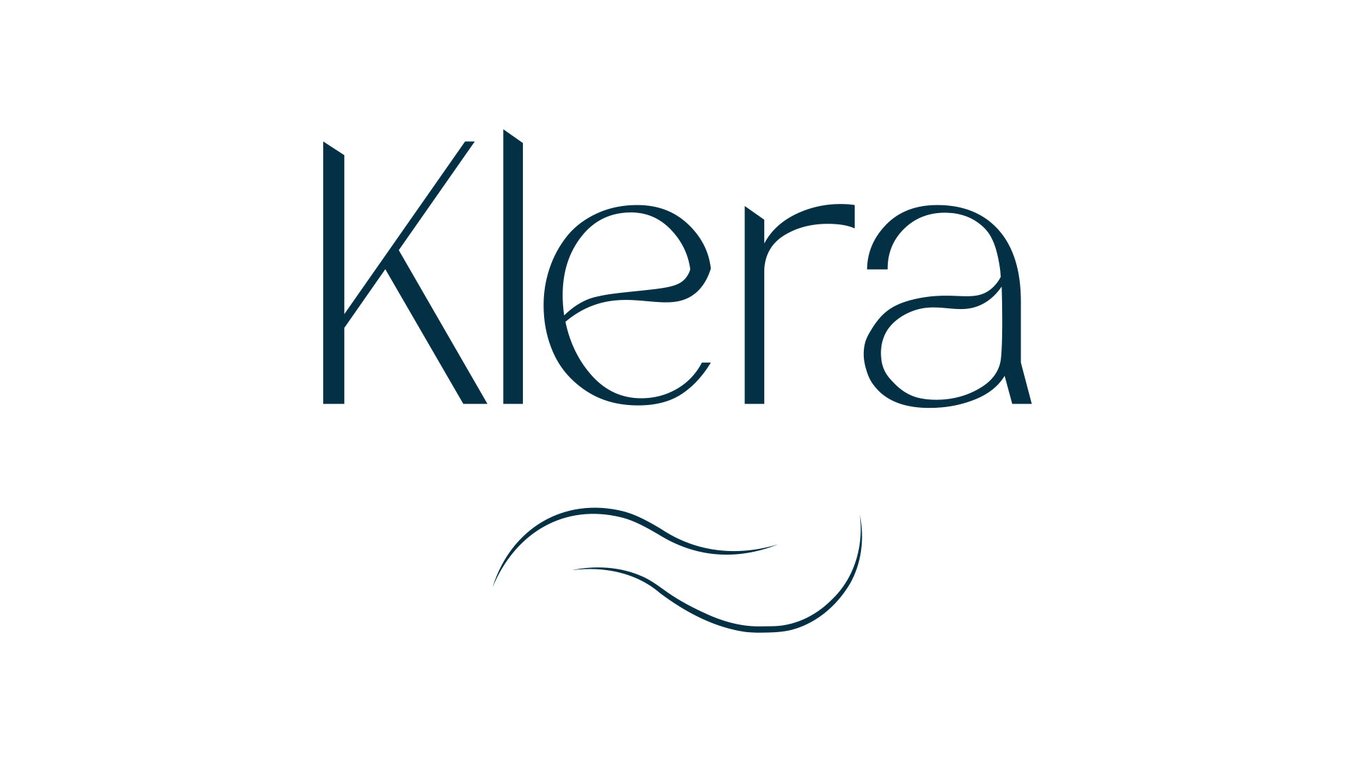
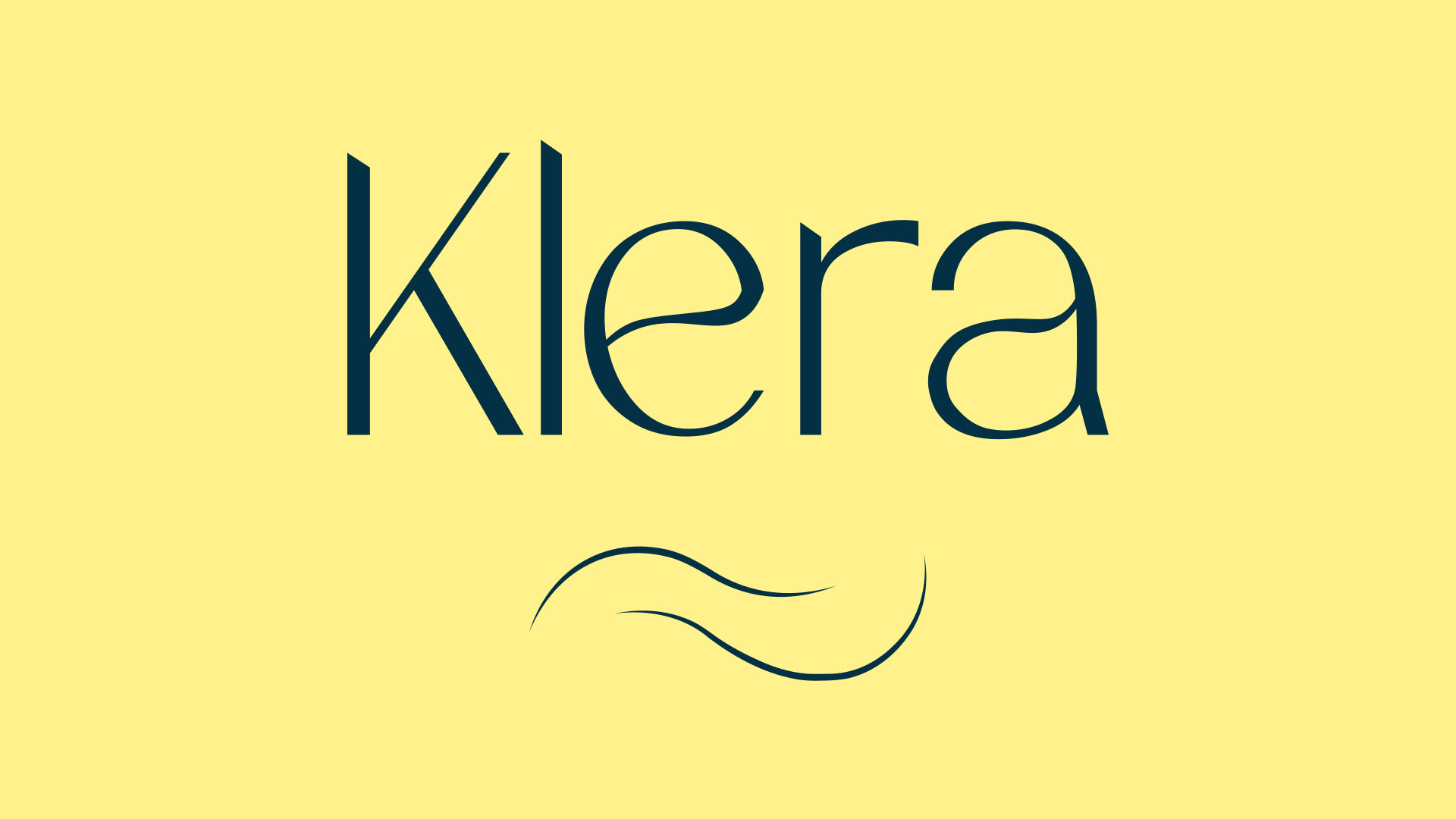
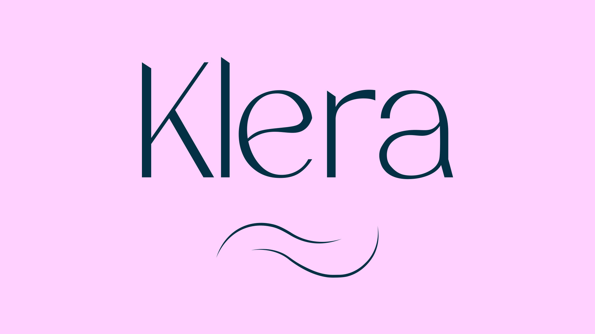
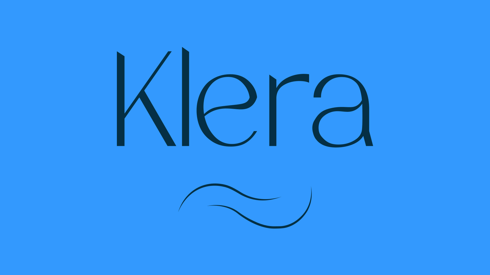
The logo is made in the font 'Nalieta', an elegant script font that brings out the strong yet feminine traits Klera follows by. The letters 'e' and 'a' are skewed with curvy strokes in order to show the smooth-sailing element of Klera and how it tries to think about the ingredients behind its beauty products. The wavy icon further emphasizes Klera's vision in always trying to think forward in what ingredients can be used in products to combine beauty and health together. The element of the 'wave' is further emphasized in its marks for the packaging design. The color theme for the brand is a mixture of bold colors and pastel colors. These help represent the brand's personality of catering to women's beauty standards as well as striving to always better their product knowledge.