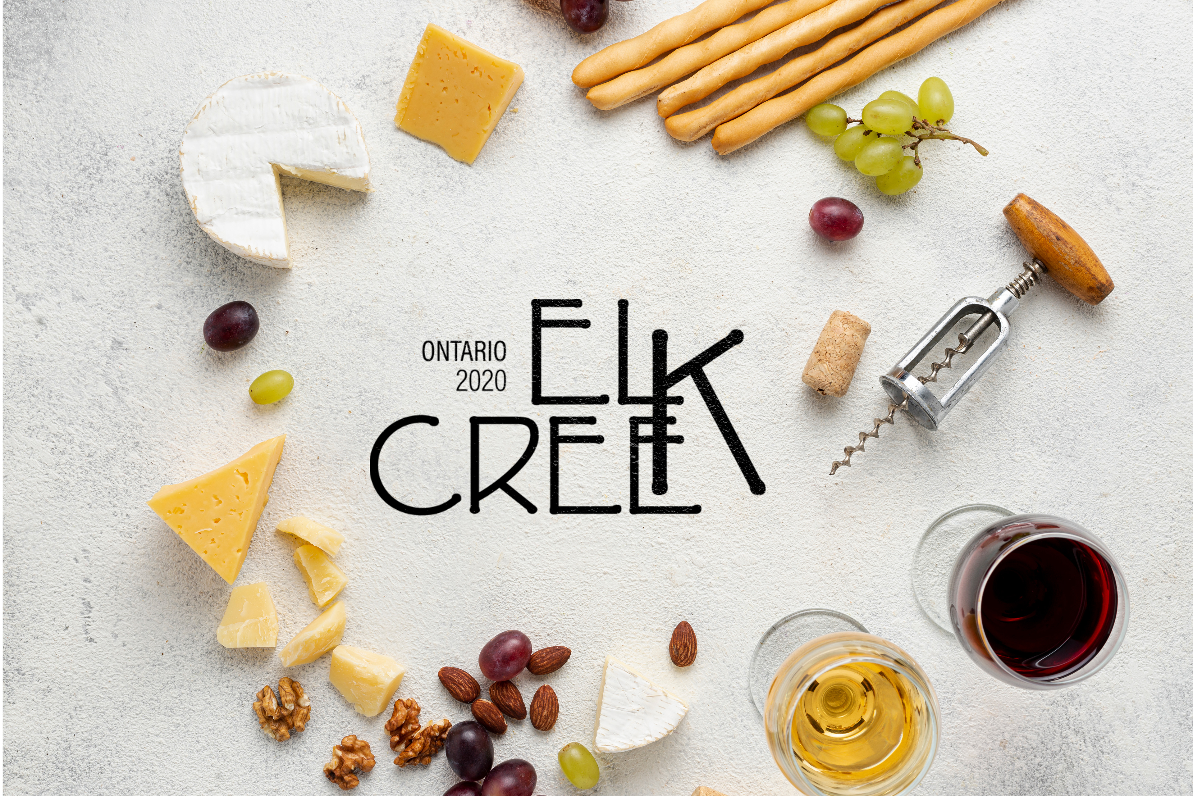
Elk Creek is a wine brand. It wants a logo design that depicts the brand's offering, message, and personality. Elk Creek offers red organic wine with focused selection of blended wine. The purpose behind these wines is to experiment new flavours and feel adventurous. The target audience is between age 27-80 who want to try new experiences. They have a disposable income and they are design centric. The personality of the brand is artistic, modern, and unique. They don't want any shapes or graphics for the logo design.
MY ROLE
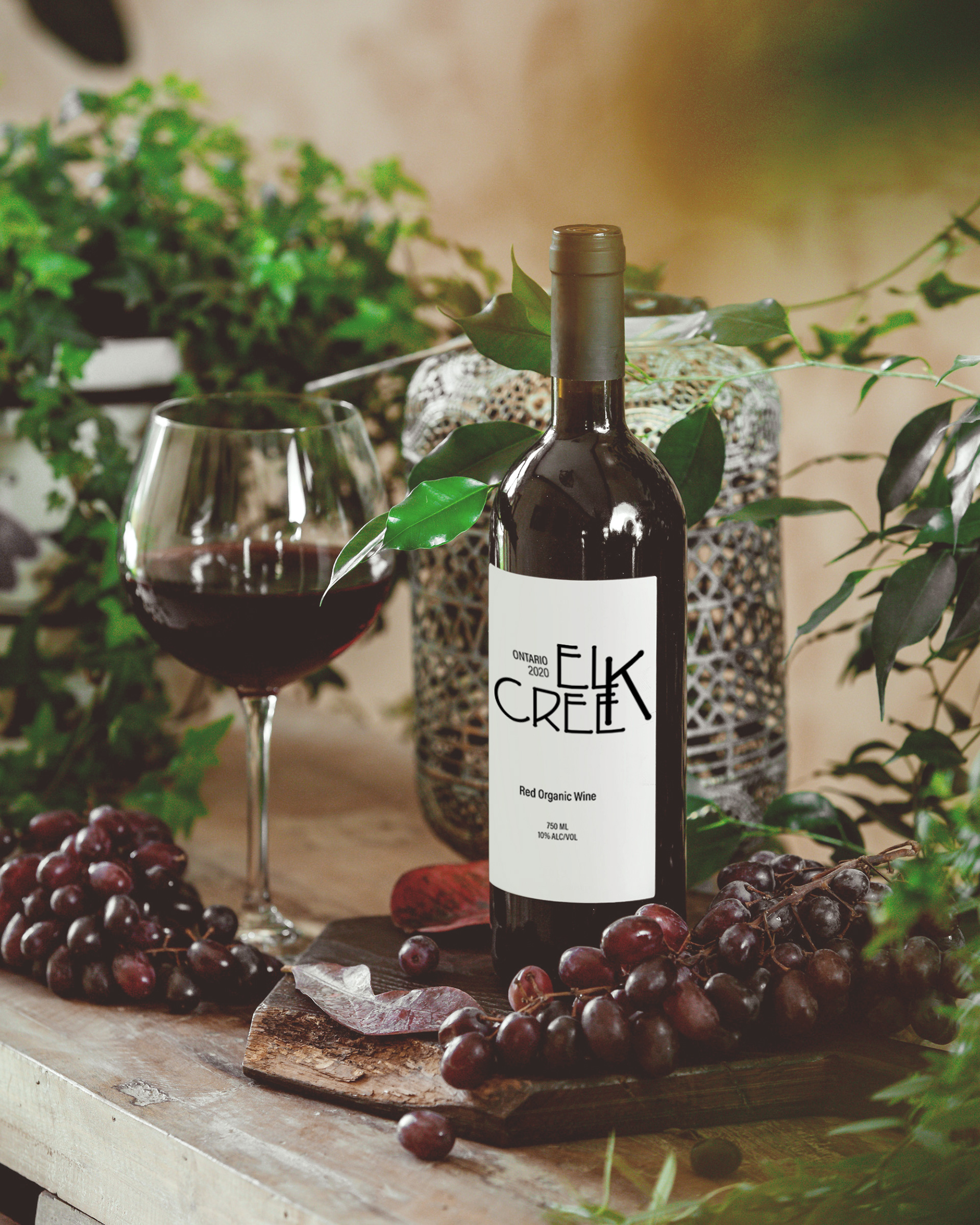
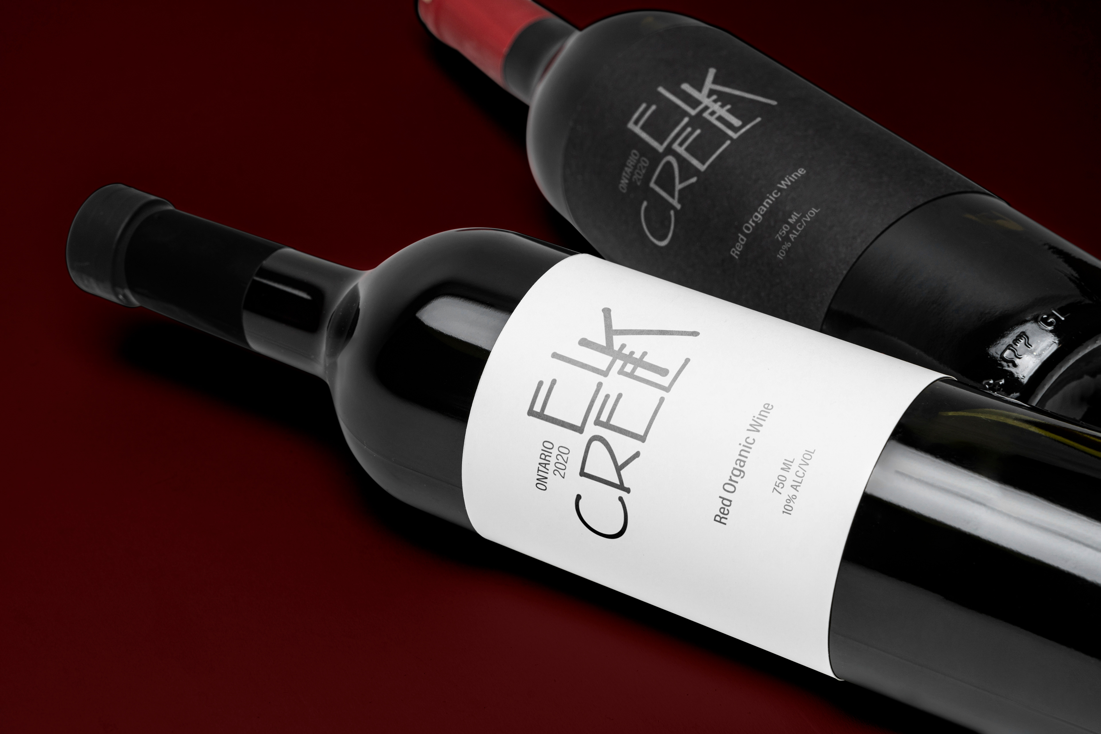
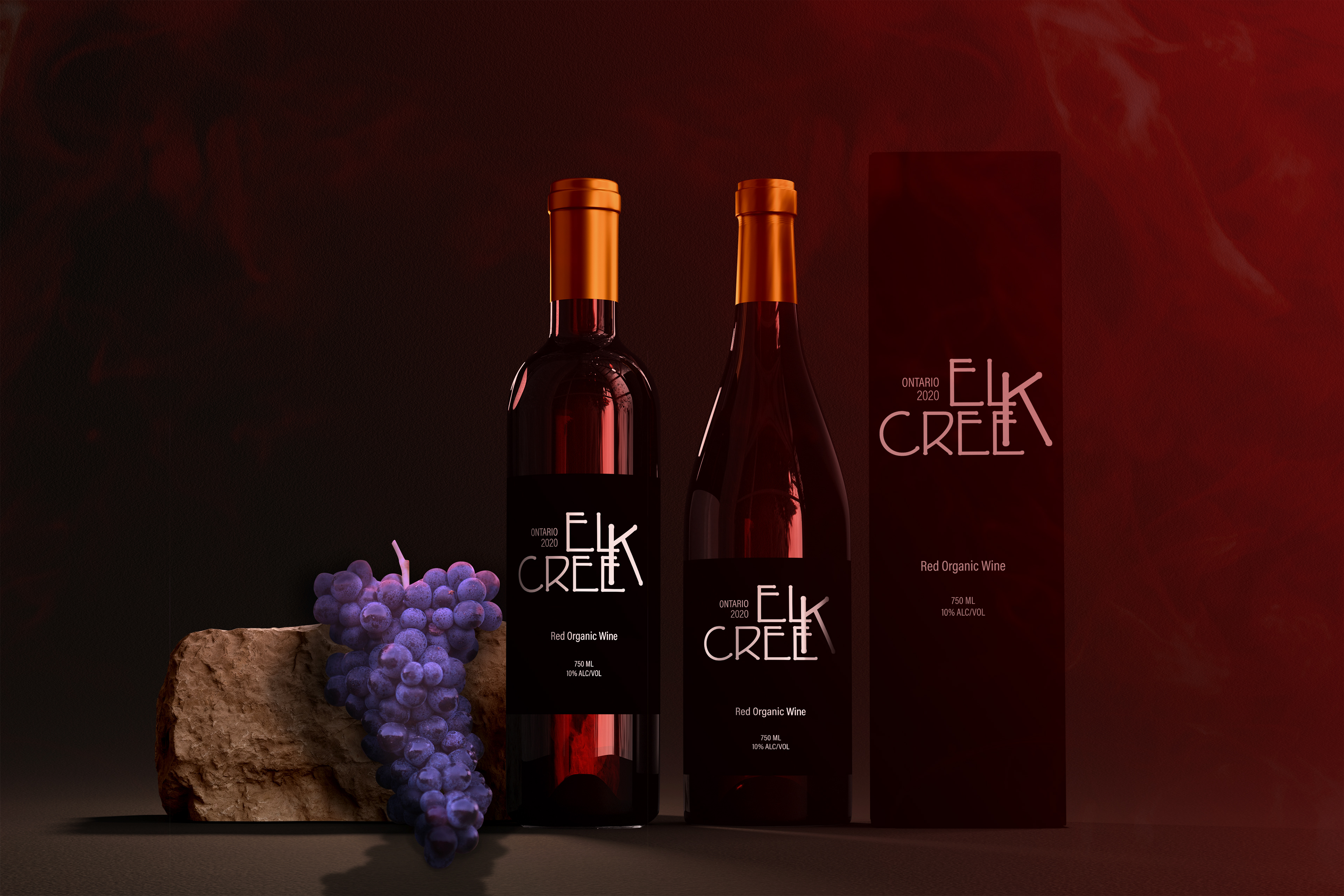
I made the logo and label design for Elk Creek, keeping in mind of its adventurous outlook and brand standards.
THOUGHT PROCESS:
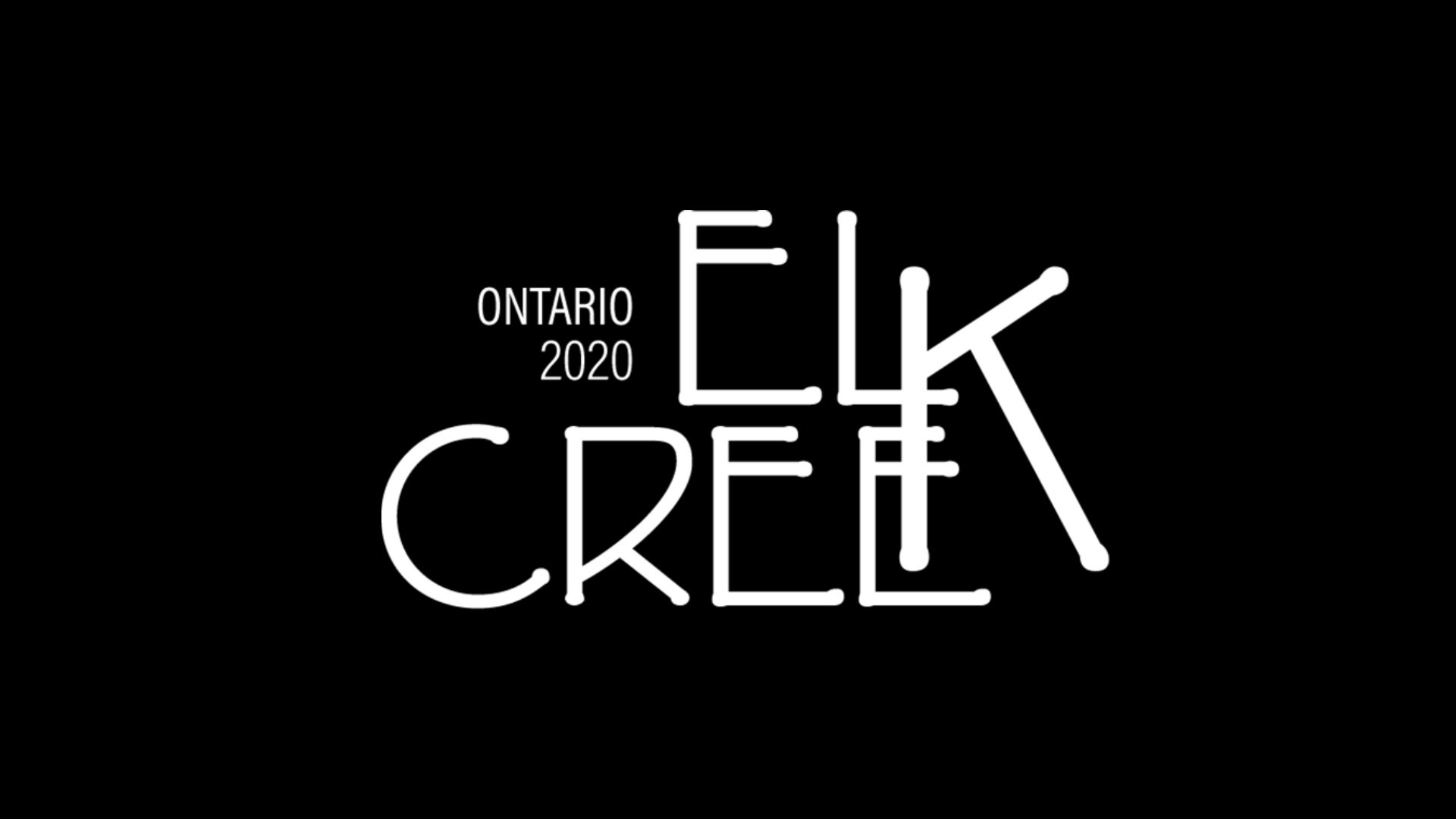
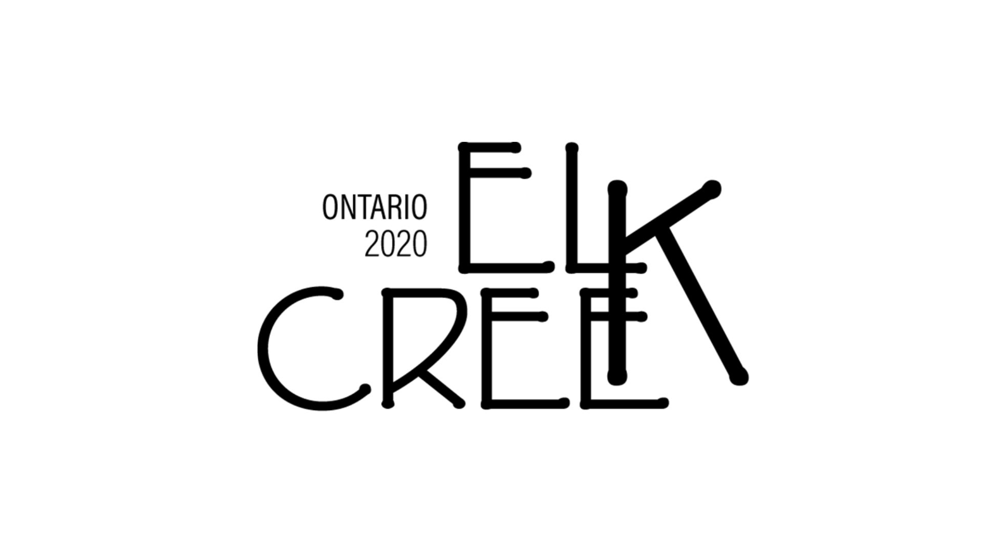
The typeface used for the logo design is P22 Eaglefeather in the Informal style of the family. This font creates the adventurous as well as creative theme the brand aligns with through its characteristics. The sans serif font has unbalanced traits such as the aperture and open counter having contrasting sizes. This give the typeface a fun movement through its strokes, helping in bringing out the message of being adventurous. Not only that, but the characteristics are distorted through the last letter of 'ELK' and 'CREEK' being scaled up in order to be used for both of the words. This helps in not only breaking out of the ordinary, but also unifying the logo as one.
Softwares used: Illustrator and Photoshop