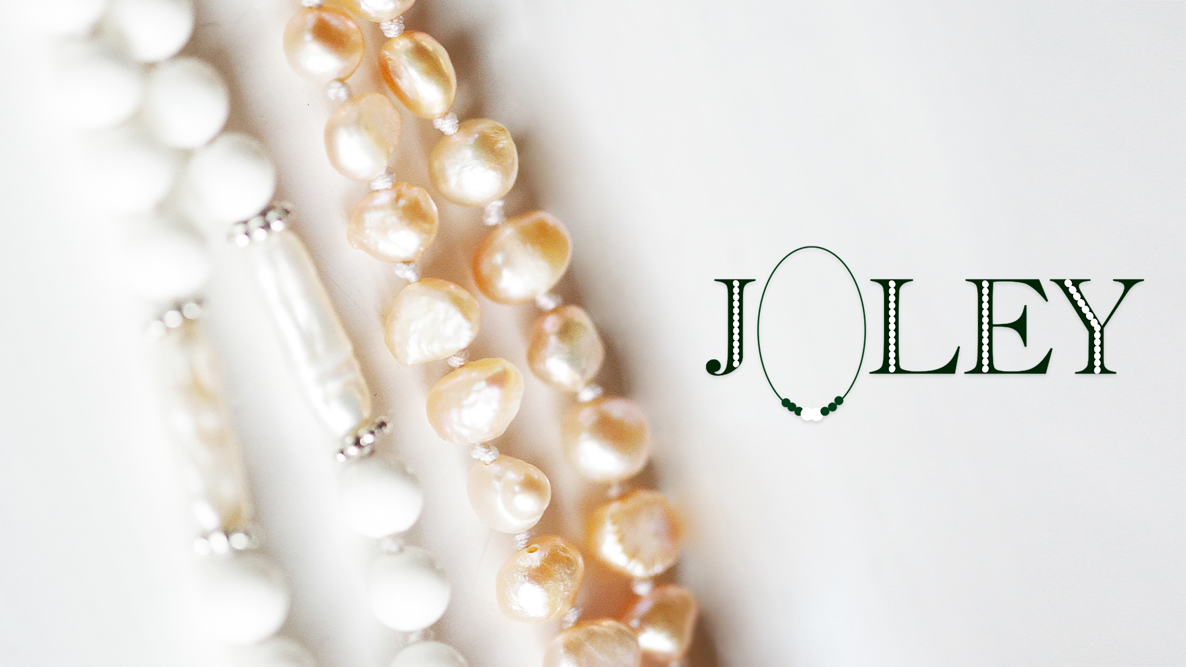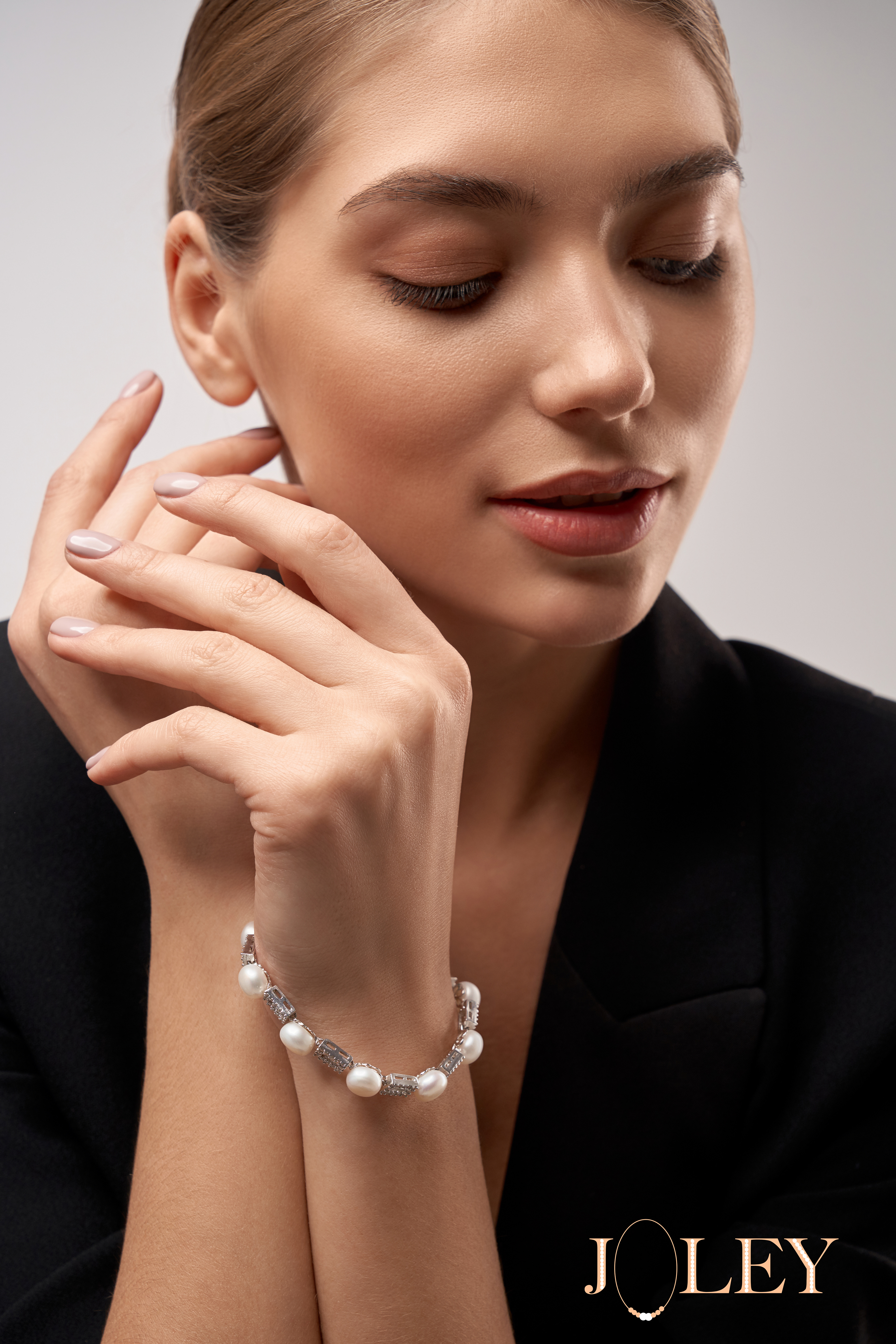

JOLEY is a small, family-owned brand that specializes in pearl jewelry. While starting off as a small business, JOLEY strives to bring luxury in the world of accessorizing through focusing on using high-quality pearls for the jewelry it makes.
MY ROLE
I set out to create a logo design that represents their luxurious yet family-owned roots of being jewelry designers.


THOUGHT PROCESS:
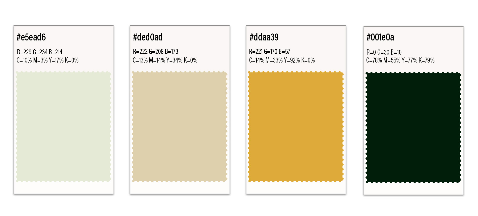
The logo consists of an illustration of a pearl necklace as part of the letters. This element, along with pearls covering the letters helps represent the hand-made element of a small, family-owned business. While the illustrations represent the brand's crafty roots, the dark green color and soft beige give the brand the 'timeless' appearance through their bold yet soft perspective. The rich and neutral colors unify with the notion of the brand representing luxury. The Serif typography of the logo gives it a sharp and clean movement through its stroke movement, helping in making the logo stand out within different atmospheres, as well as giving the brand the 'luxury' it contains.