
Dani's Bakery is a home-made bakery founded by the owner, Danielle Francis. She wanted to create various home-made desserts for families and people in her local community. Her passion for baking is shown through her care in various desserts, and she strives to make people feel happy and cozy when they try her desserts.
MY ROLE
I create a full identity vision of a small home bakery that represents coziness and love through the illustrations, color, and symbolism.

THOUGHT PROCESS
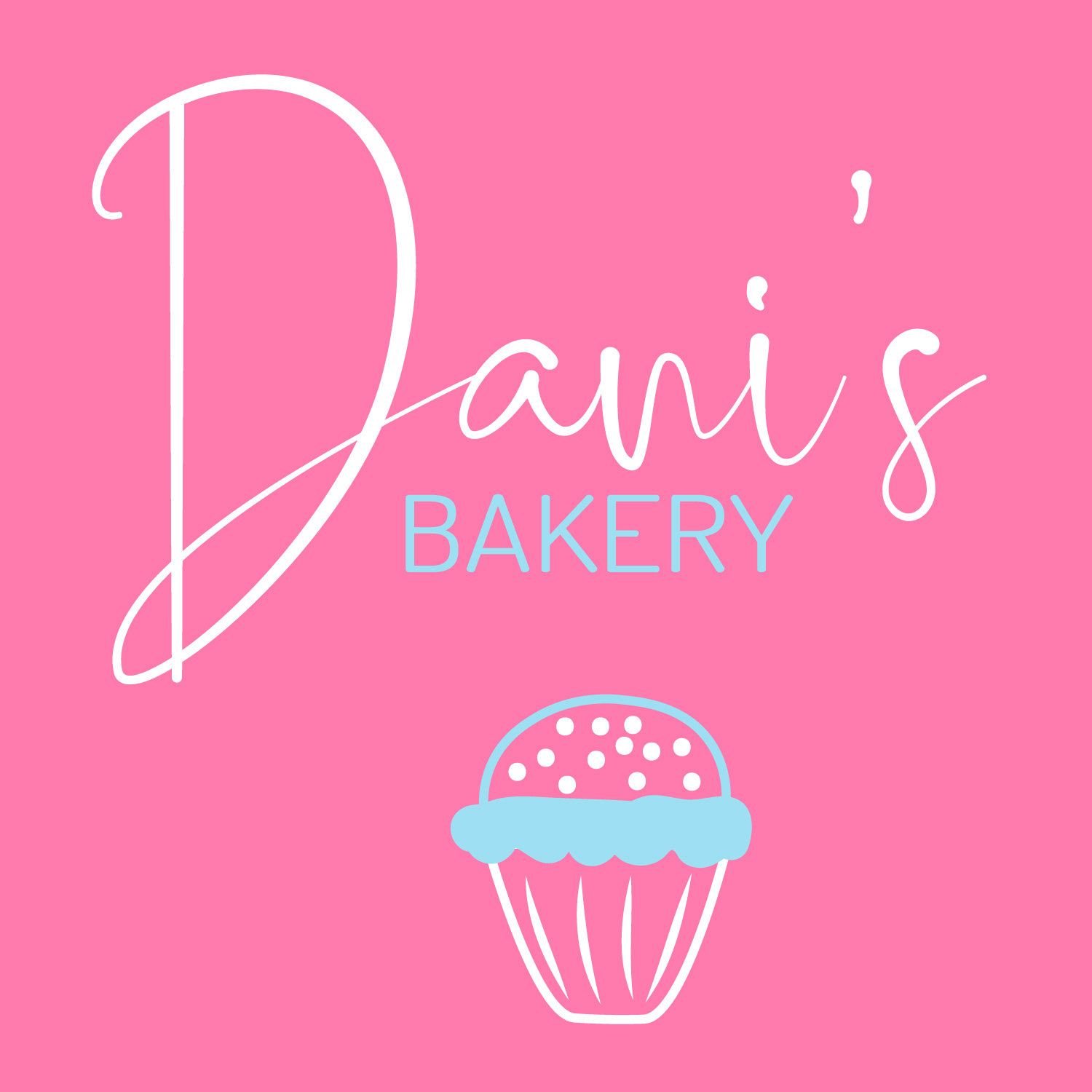
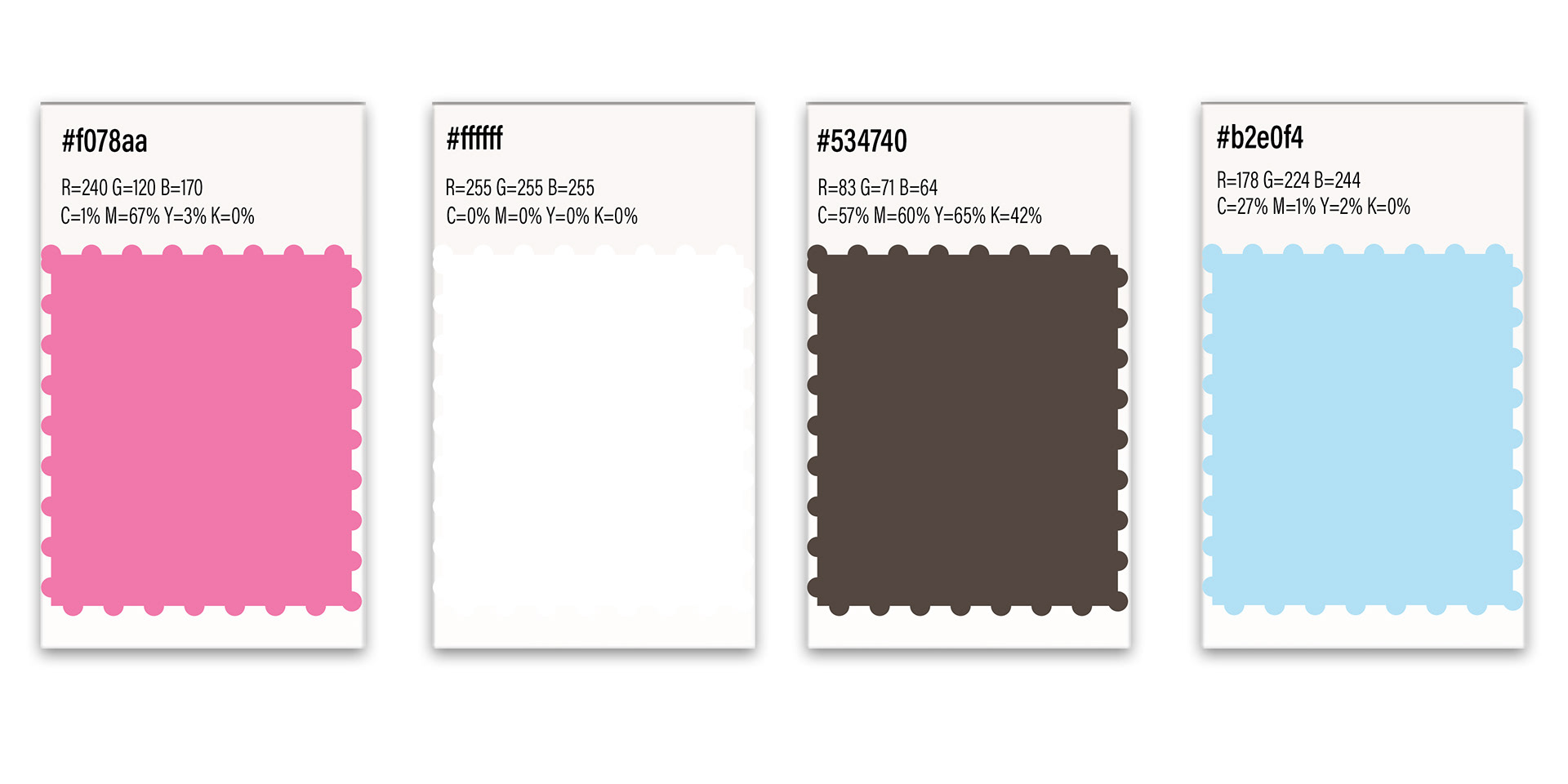
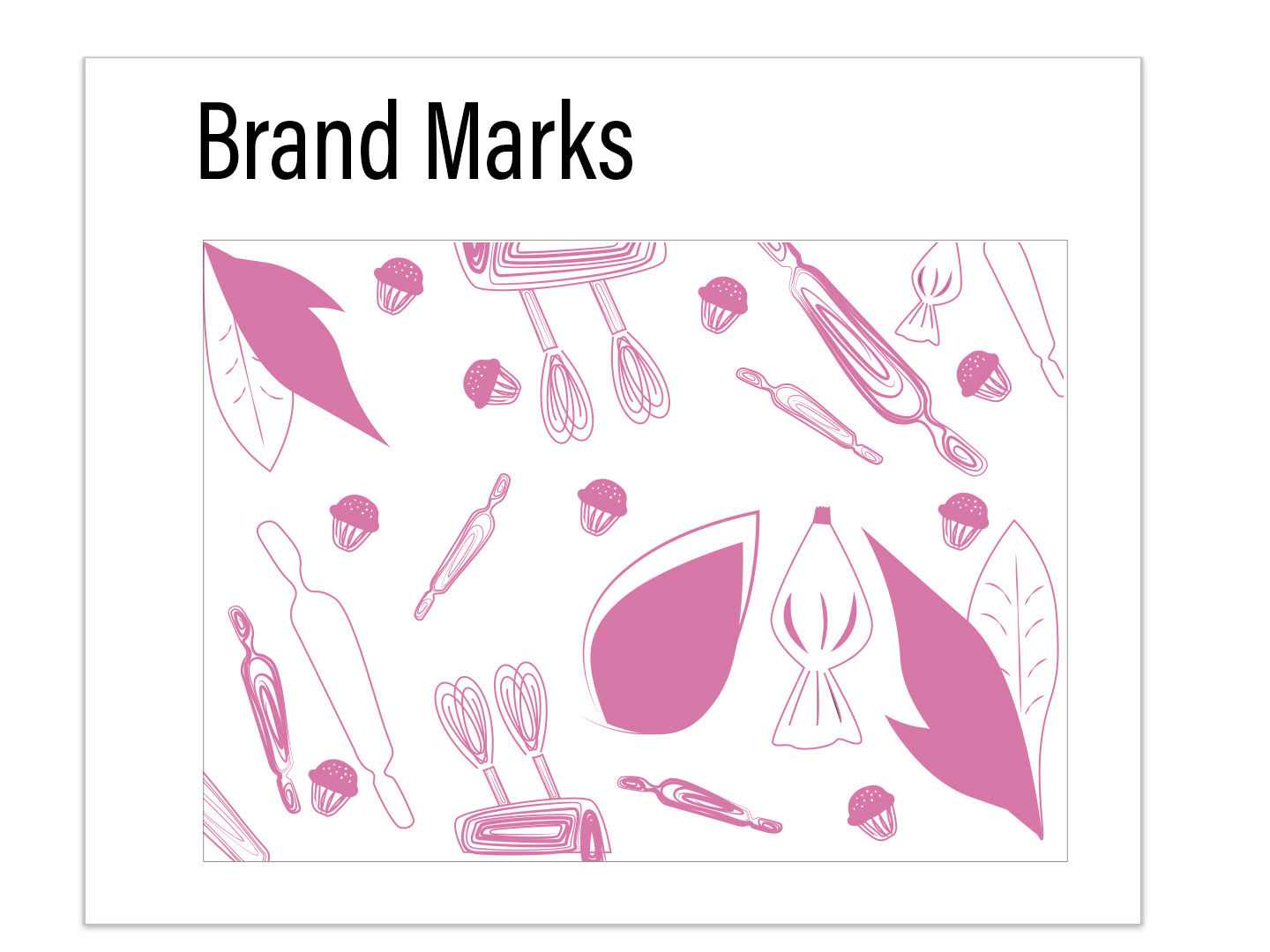
The color palette consists of pink, brown, white, and blue. These colors, when combined together, symbolize coziness and joy, traits that Dani's Bakery has. The marks used in the identity are illustrative drawings of tools and symbols that represent joy and baking, catering to families and friends.
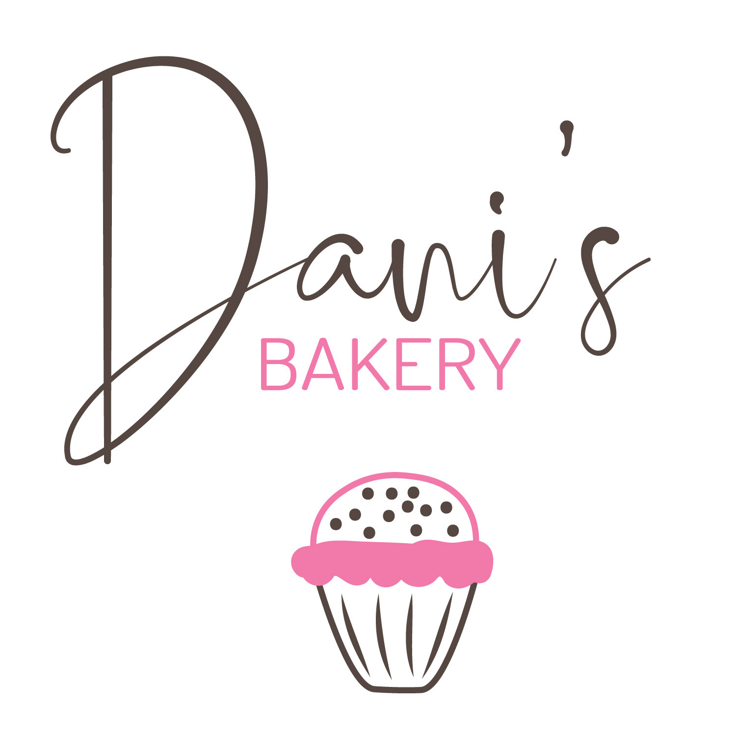
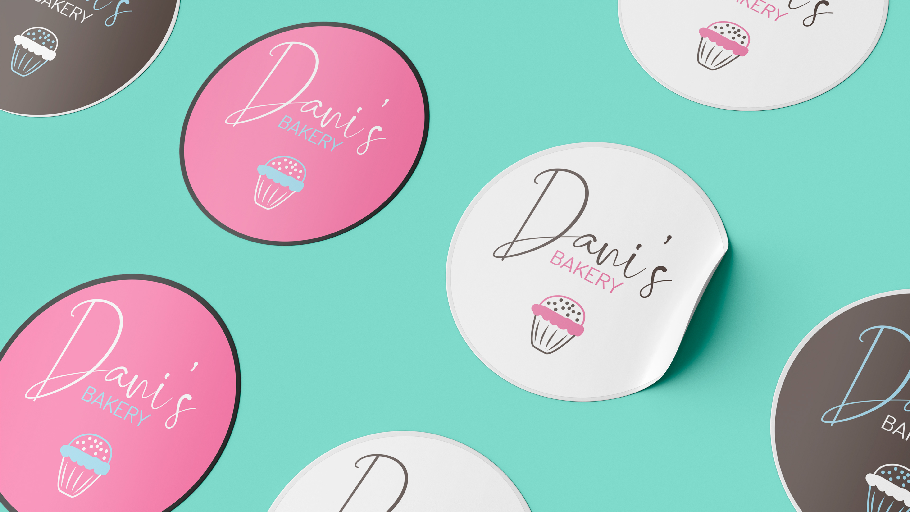
The logo design consists a combination of simplicity and playfulness in its font. When combined, these fonts represent joy as well as balance, helping in representing the identity of love and coziness. The icon is an illustration of a cupcake, a simple yet universal symbol that represents sugary sweets.
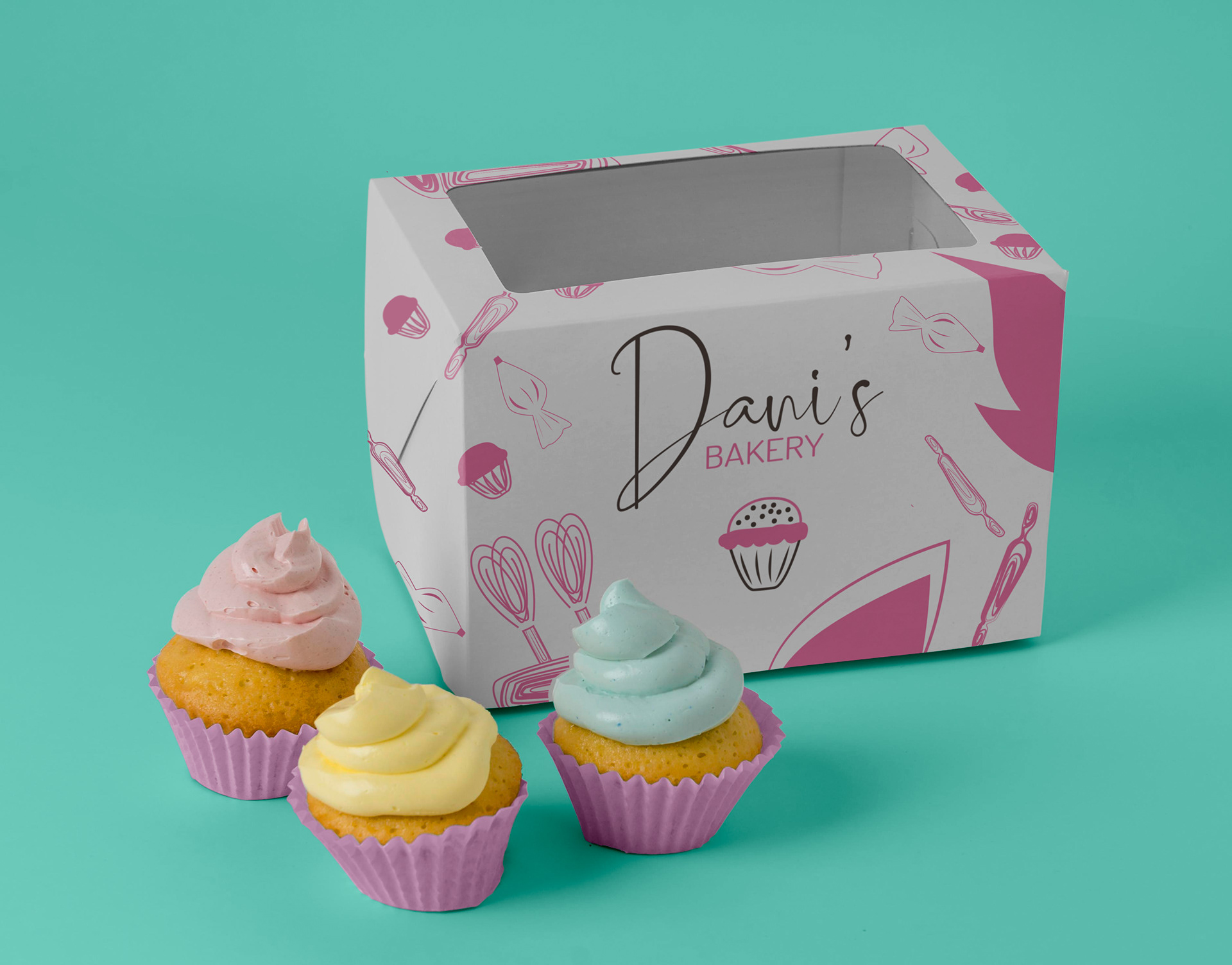
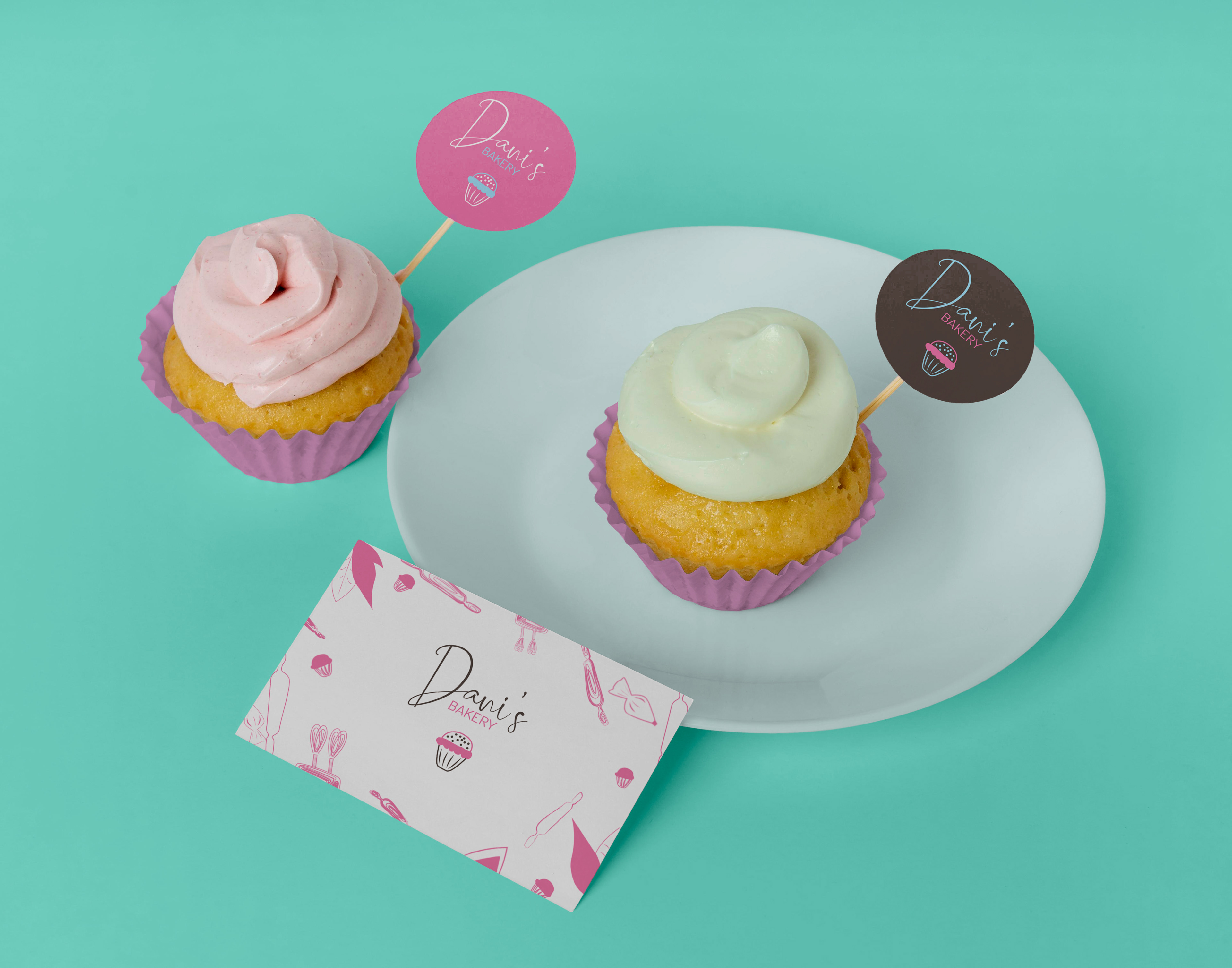
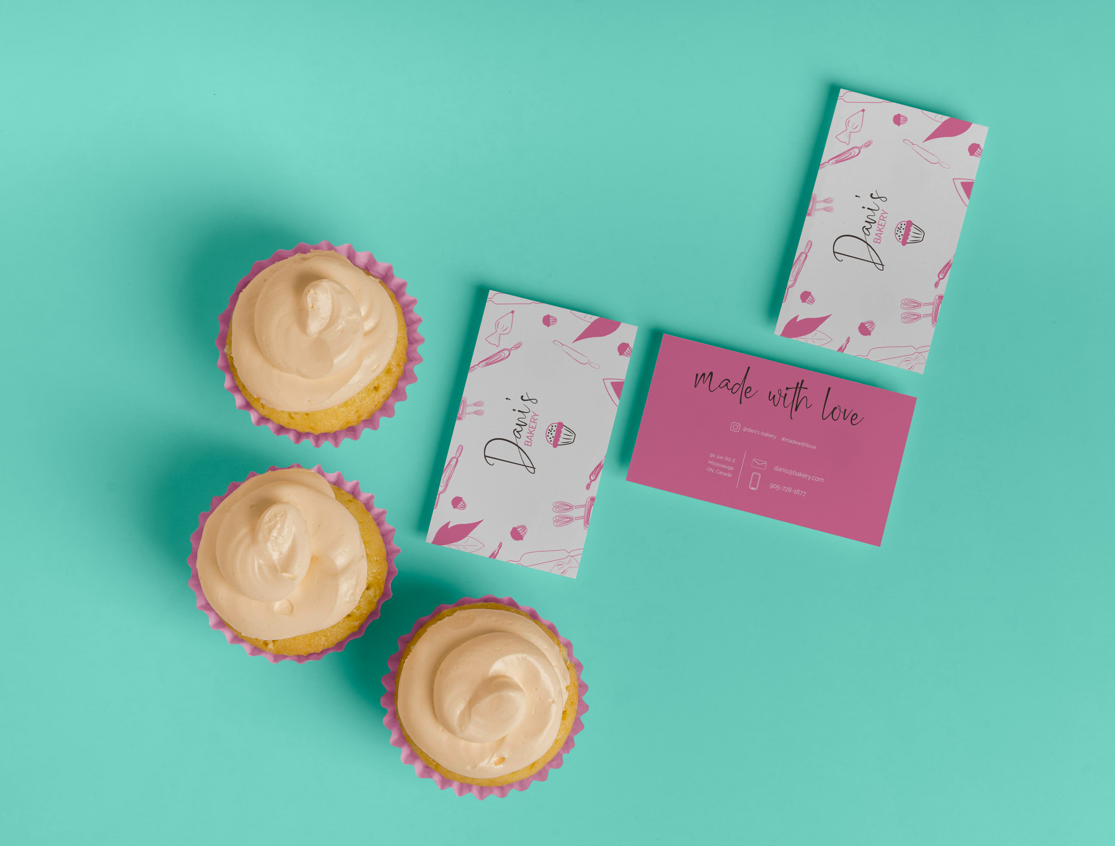
The marks on the packaging design and the pink color for the cupcake packaging helps represent the 'hand-made' element of Dani's Bakery and how she puts her passion in the desserts she makes.
Software used: Photoshop and Illustrator